The provider of this project was Domino Records, an independent record label company. They were looking for an artist who could help them with proper band merch for one of their artists.
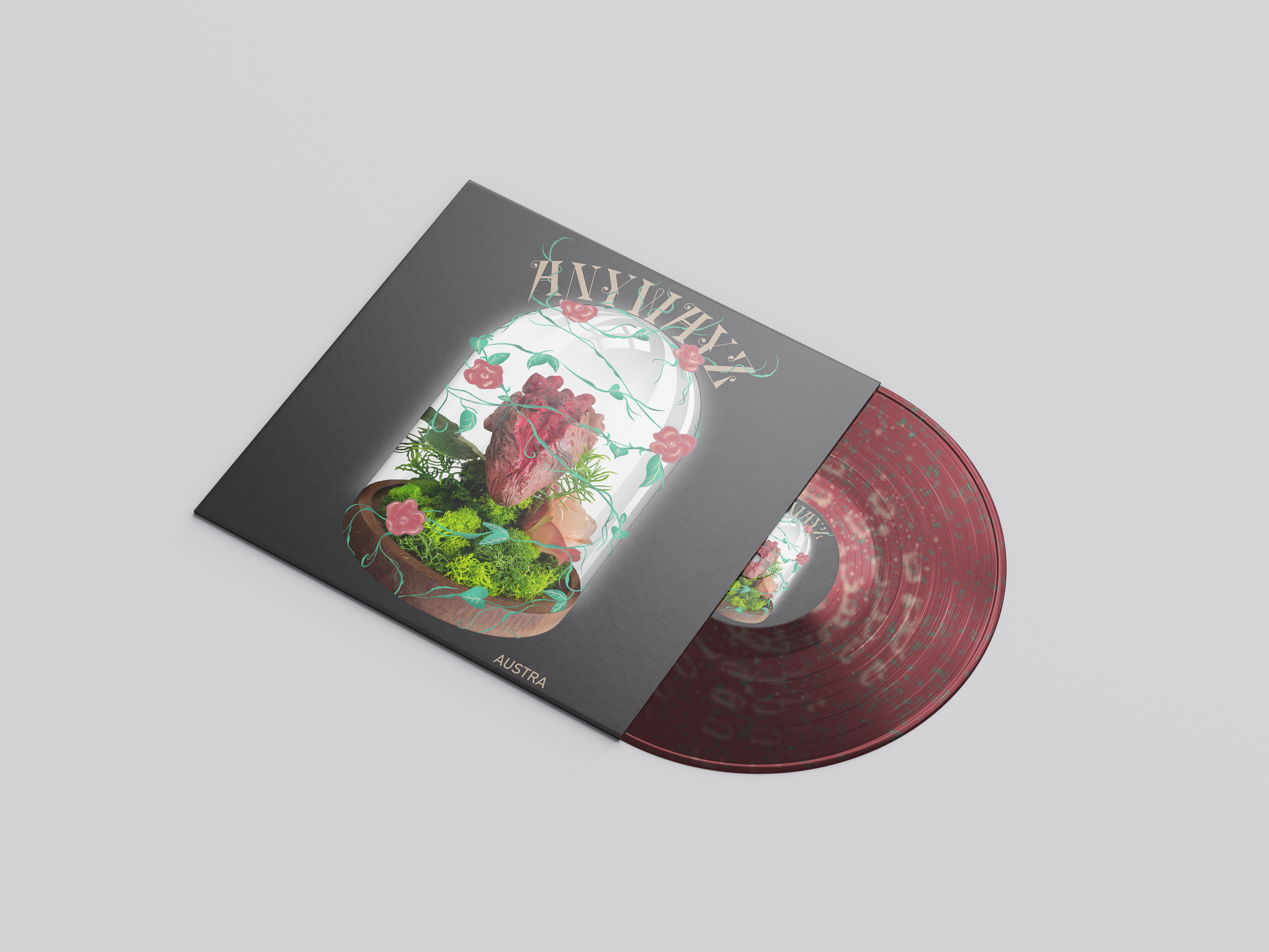
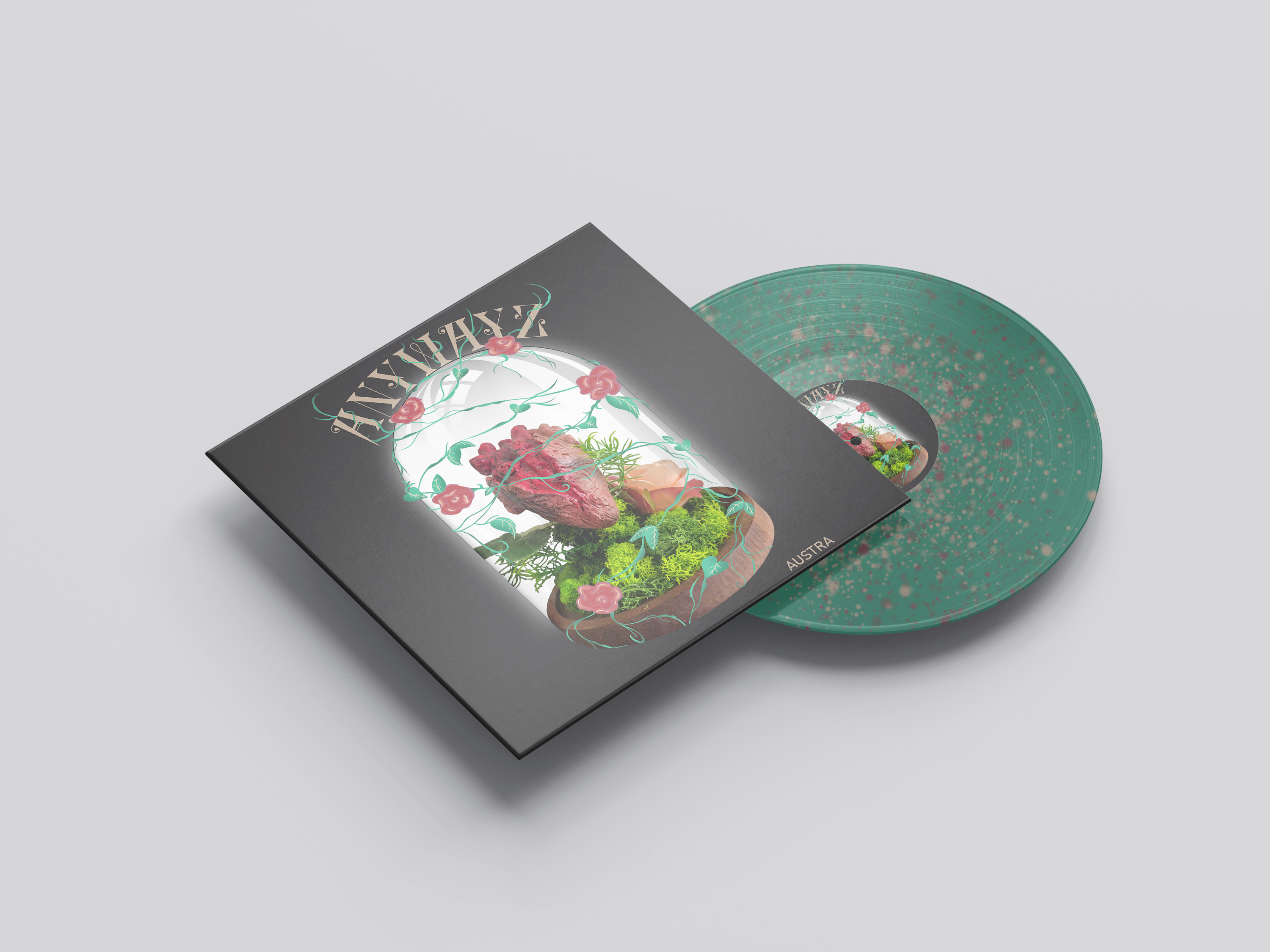
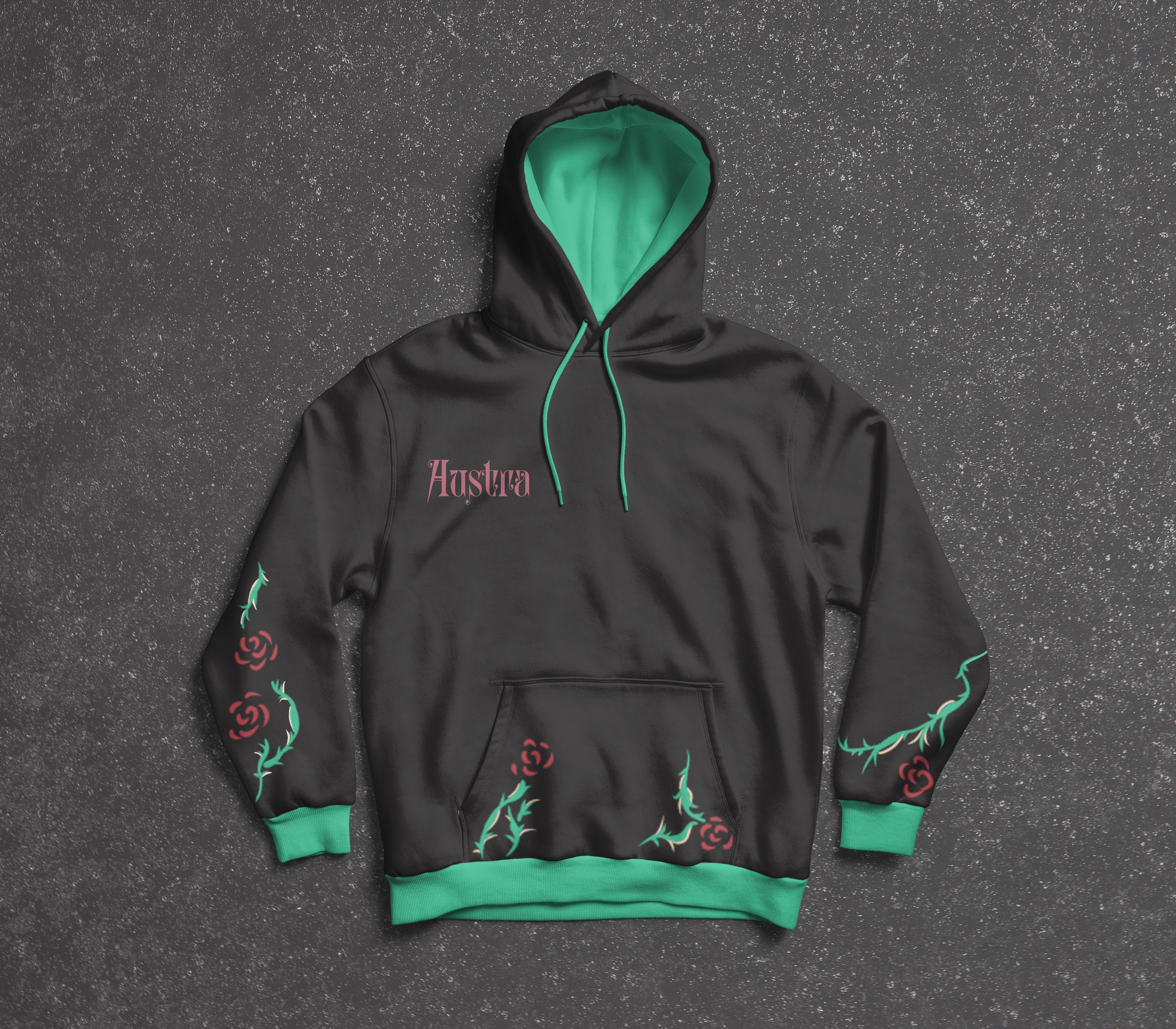
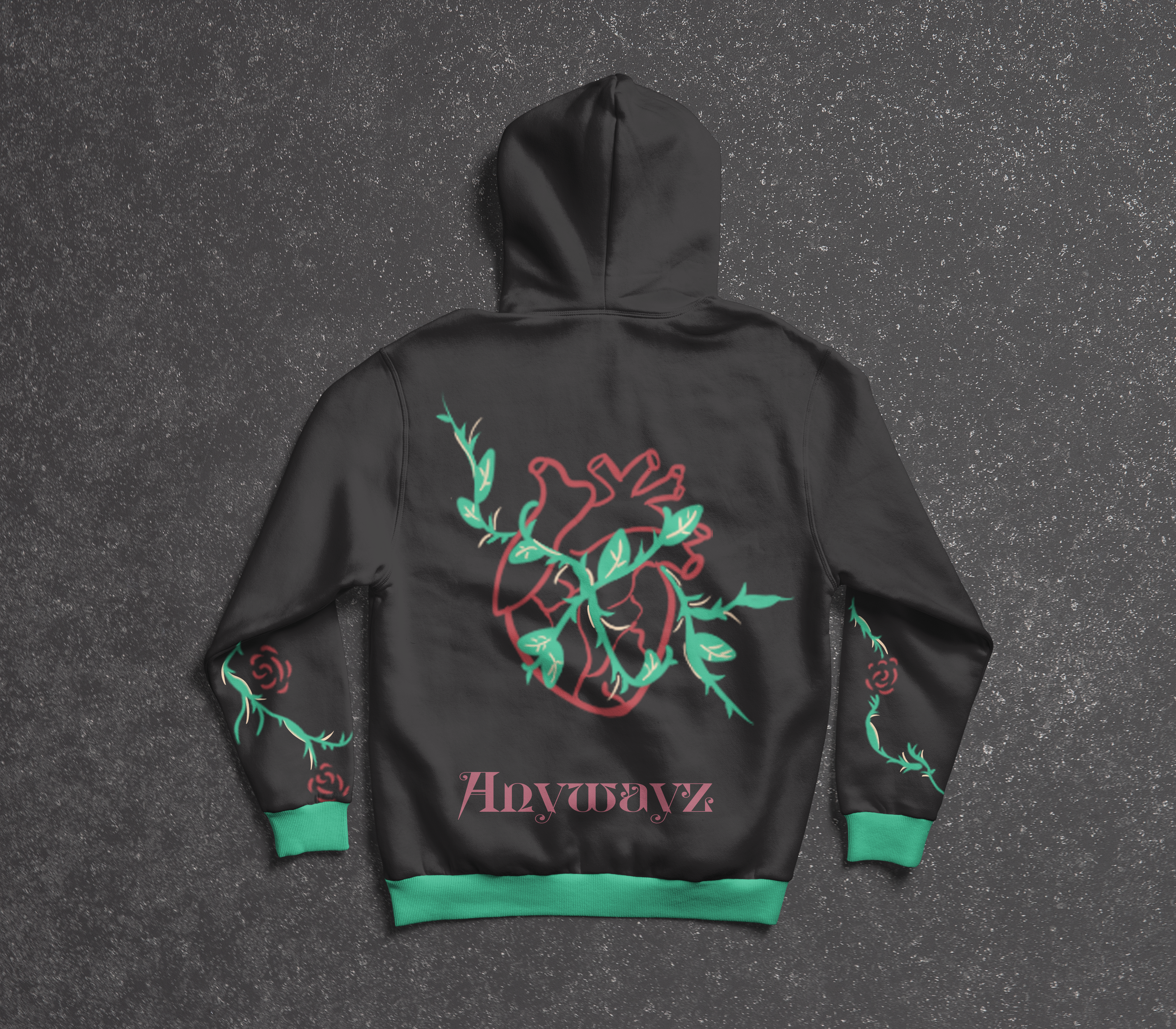
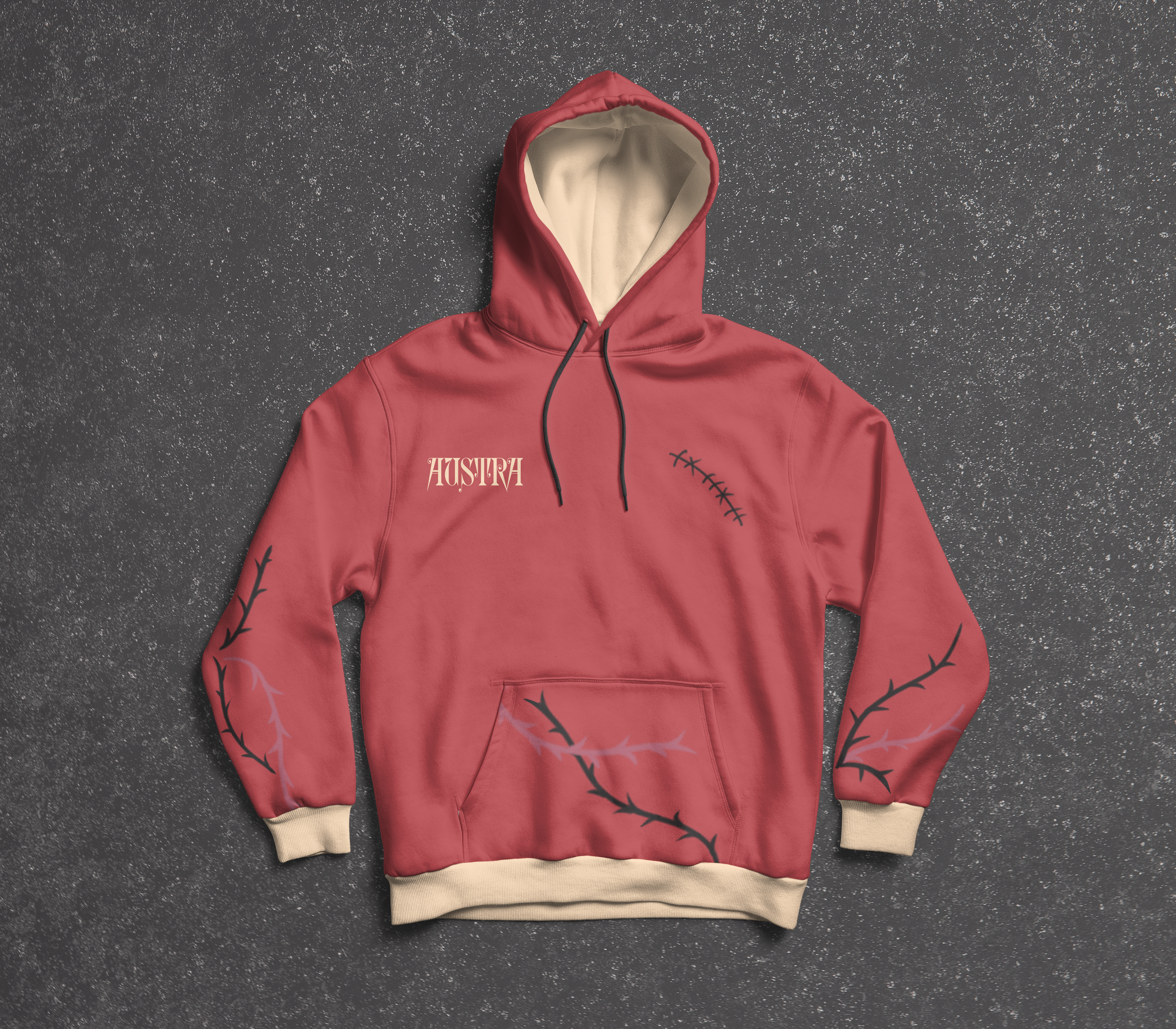
The project: Design band merch for one of the artists who work under the label of Domino Records. This project has to include: promotional art on a vinyl, Spotify reel, a fitting poster and merchandise.
Provider of the project: Sint Lucas
Made with: Clip studio paint, Photoshop, Premiere pro.
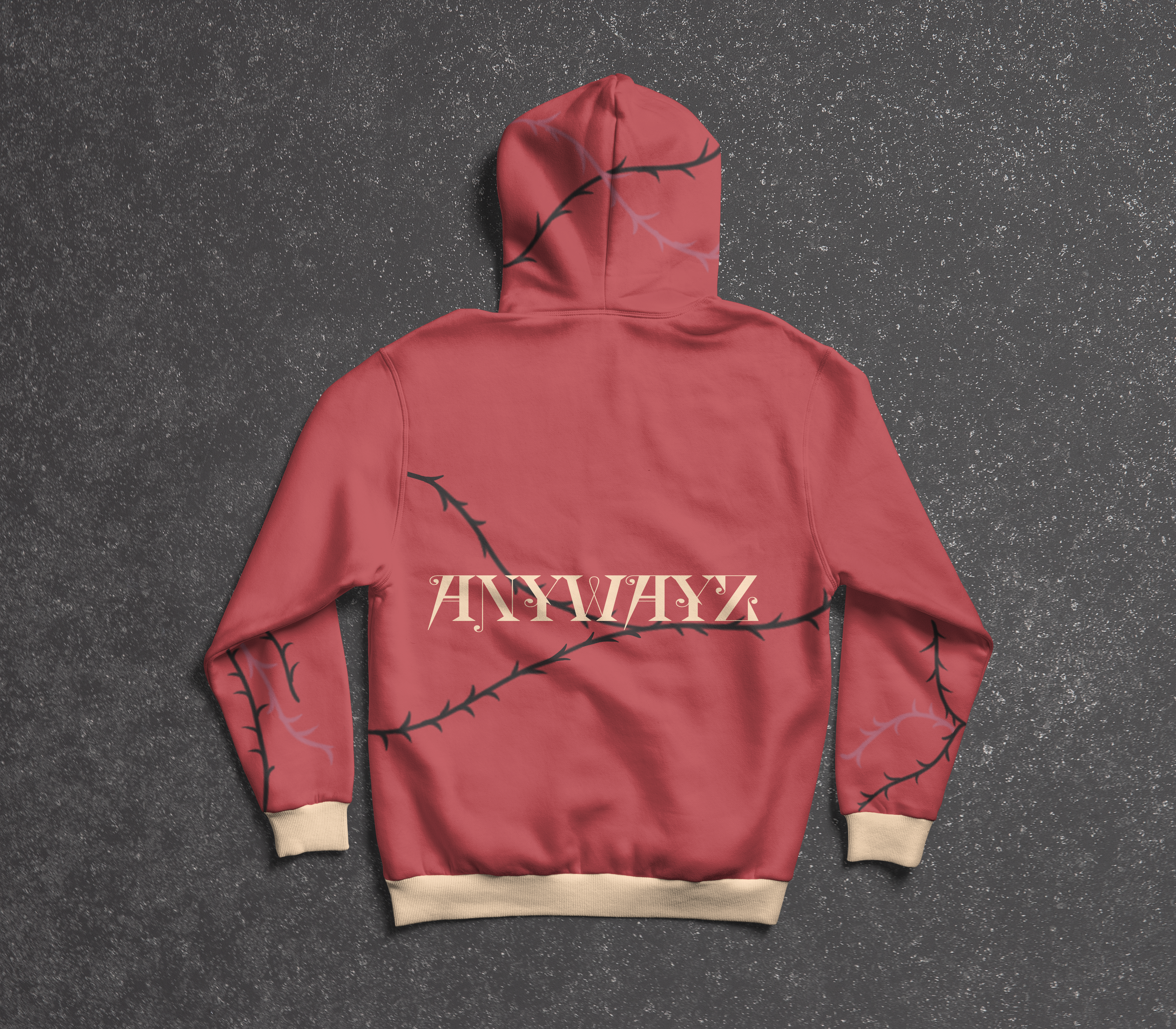
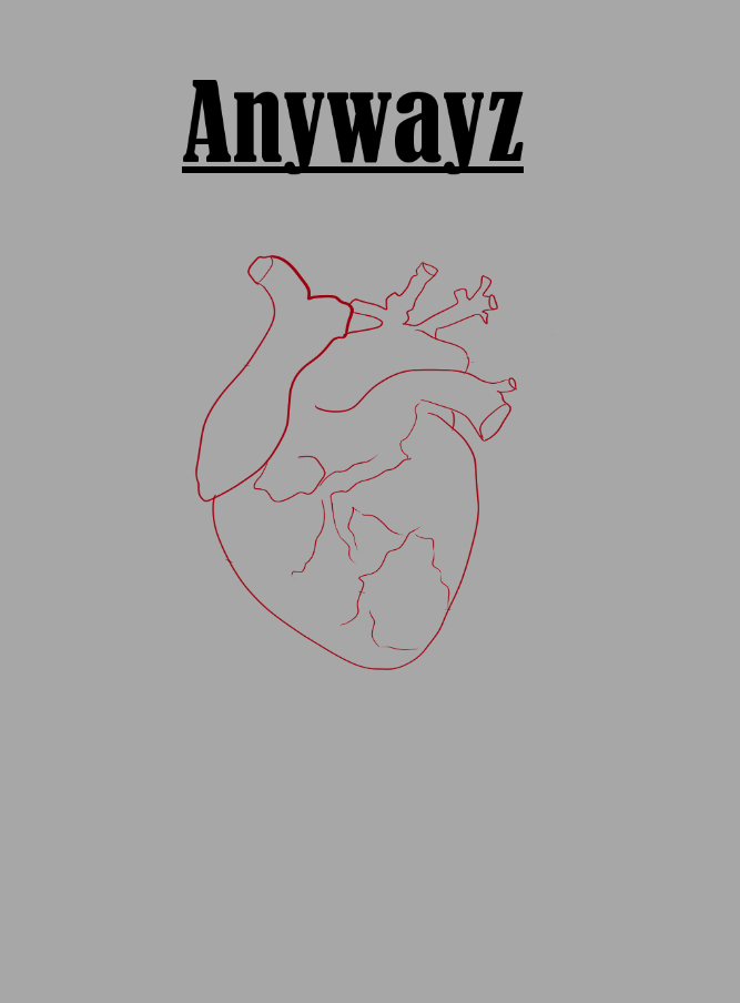
I put my heart (and a whole lot of research!) into designing band merch for Austra, specifically based on their song Anywayz. This song captures the messy, emotional journey of losing someone close and figuring out how to live without them. I made sure that the song’s deep meaning was woven into all my designs, bringing its dramatic, bittersweet vibe to life. The result? A collection that feels just as powerful and emotional as the music itself!
For this project, I created three unique and fitting concepts for Austra, inspired by their song Anywayz. My goal was to translate the song’s emotional depth into visual designs that truly capture its meaning. Anywayz tells a story of heartbreak, loss, and the struggle to move on, and I wanted each concept to reflect these themes in a creative and meaningful way.
Click on the video and images!
Click on the images!
Click on the images!
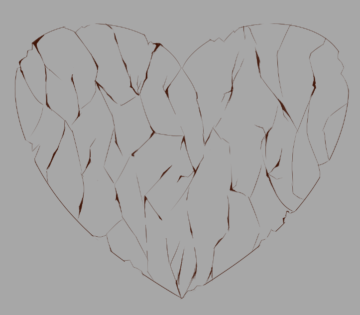
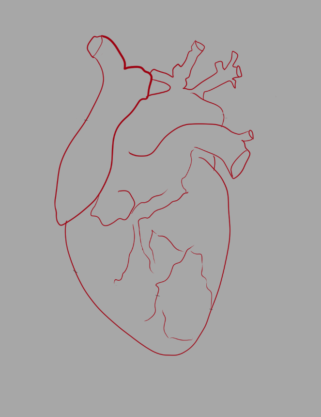
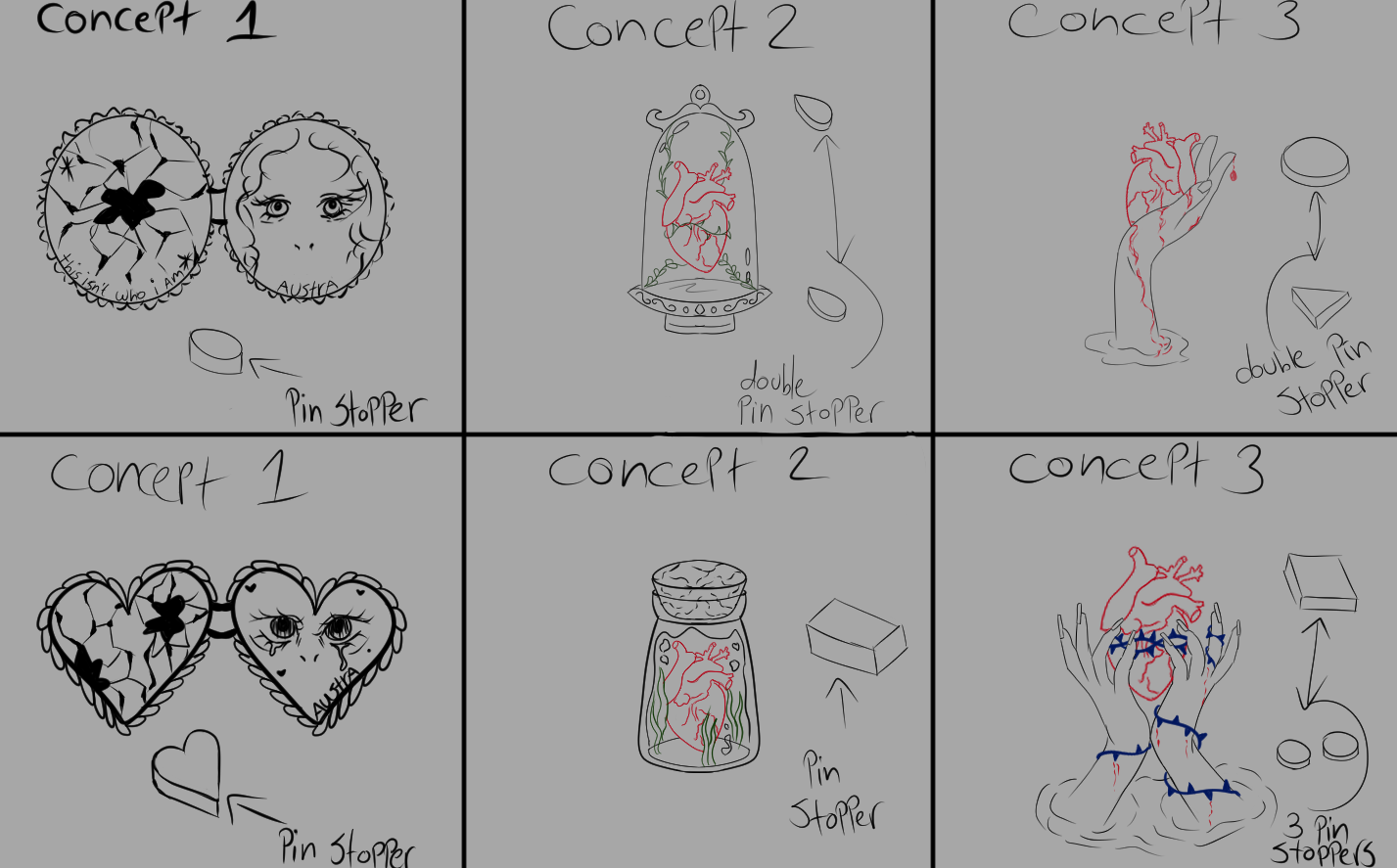
Concept 1:
In several scenes from the Anywayz music video, Katie sings while looking into a broken mirror—symbolizing heartbreak and the painful realization that someone is no longer in your life. I want to capture this emotion in the cover design.
My concept features shattered glass or a broken mirror arranged in a heart shape, set against a white background or mirror frame. Beneath the glass, I’ll include a photo of red, teary eyes, symbolizing sorrow, with delicate pink petals around it.
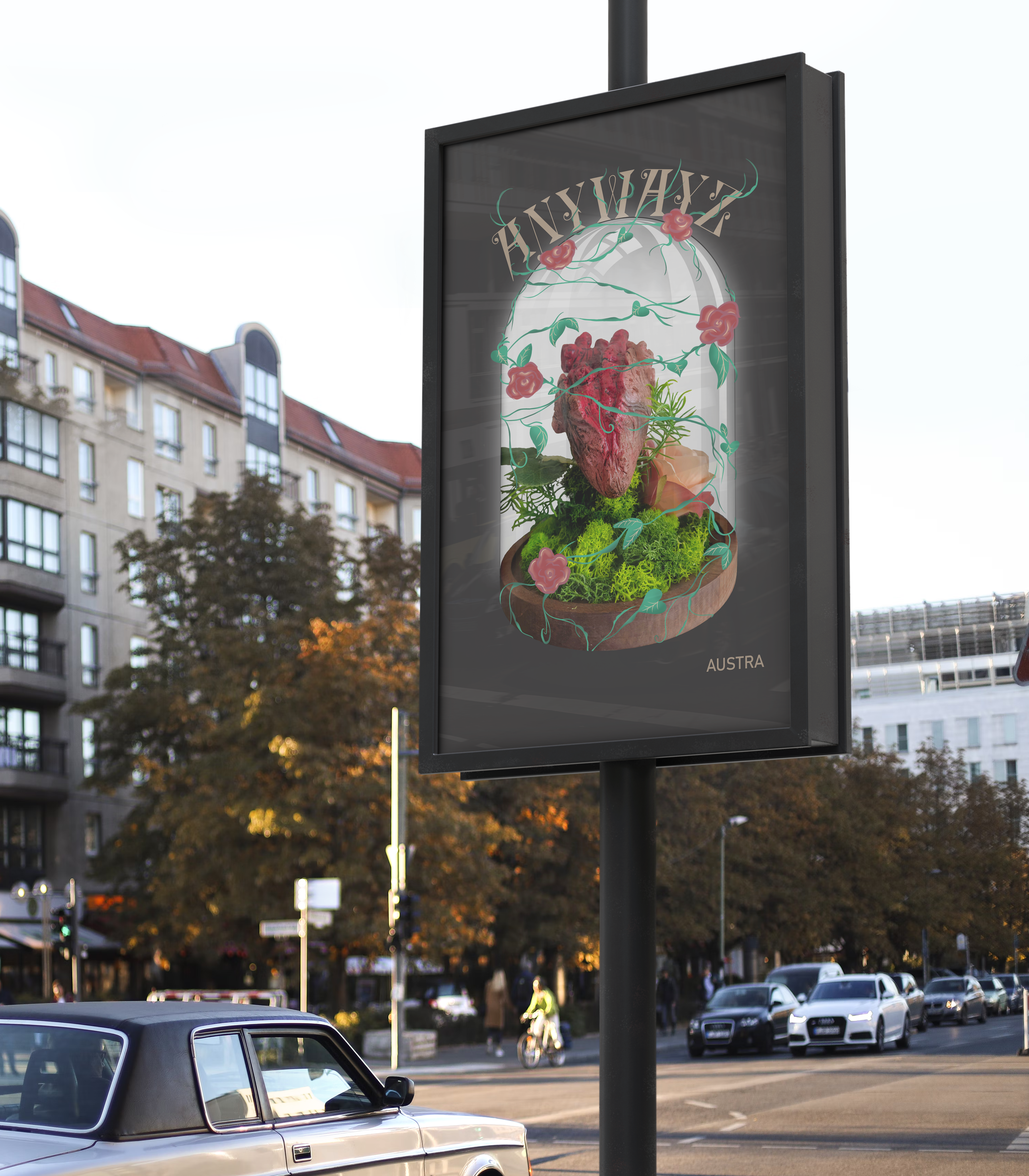
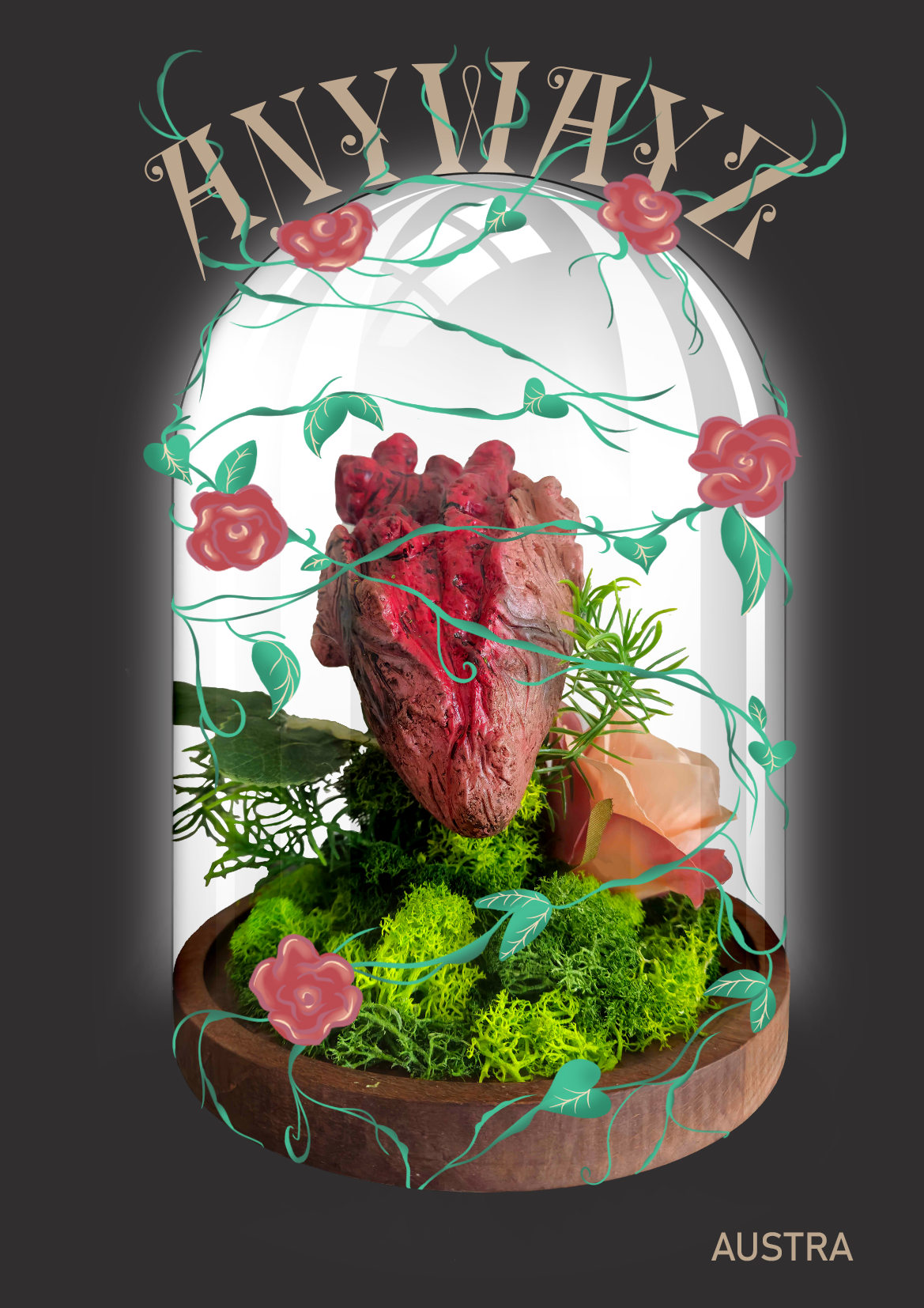
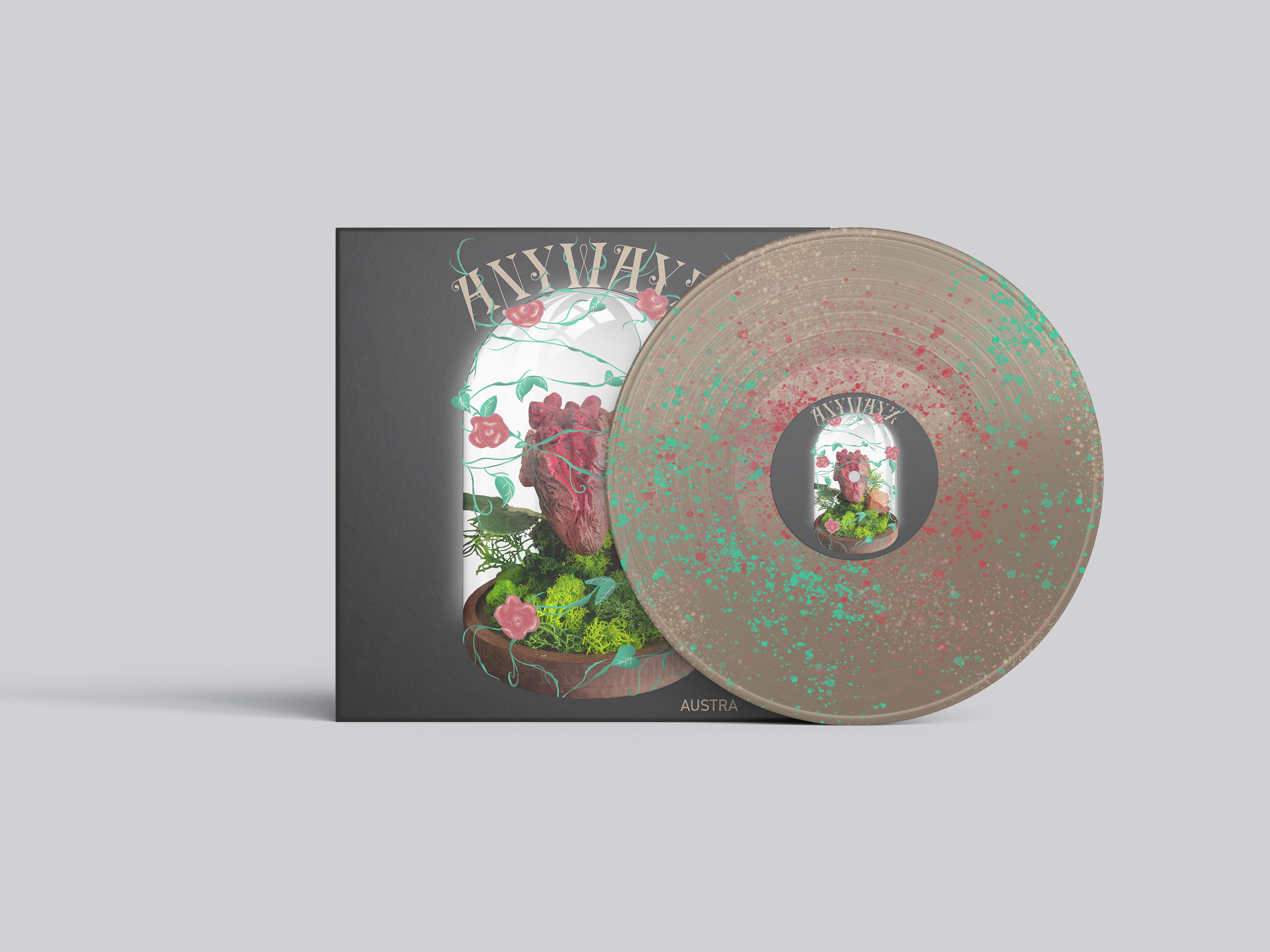
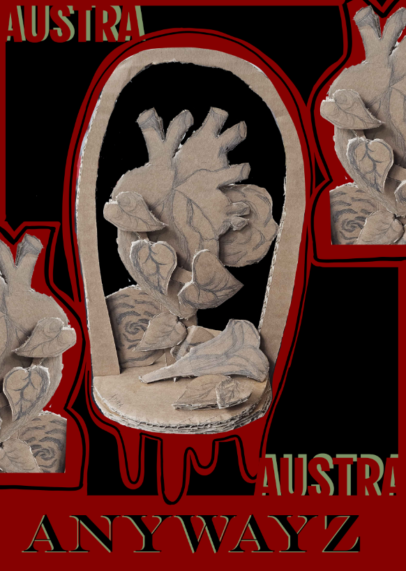
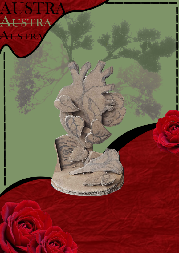
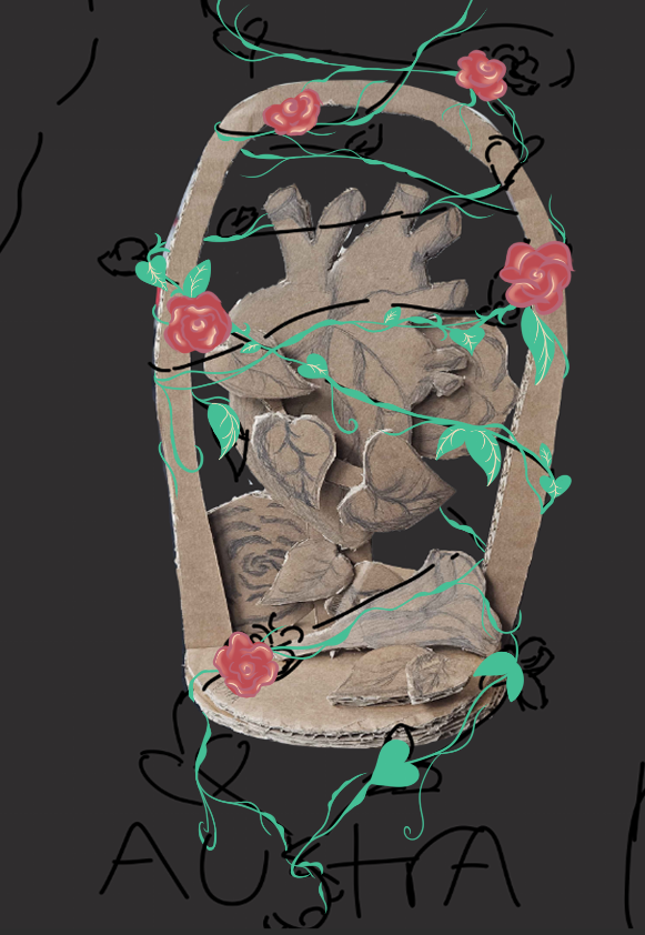
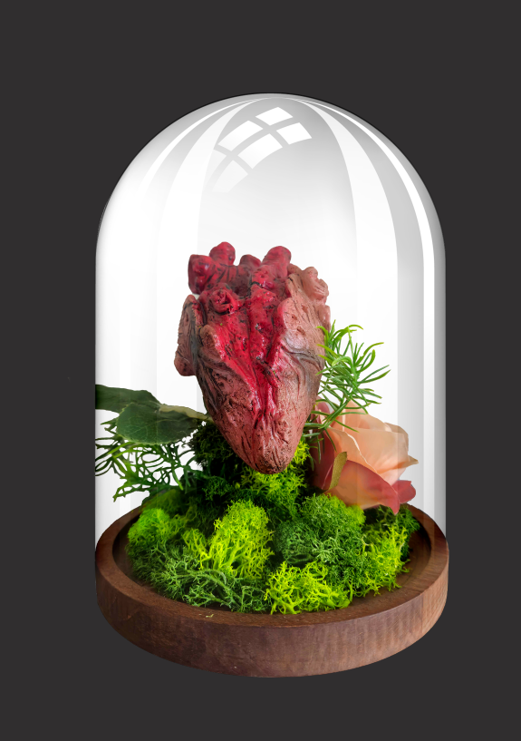
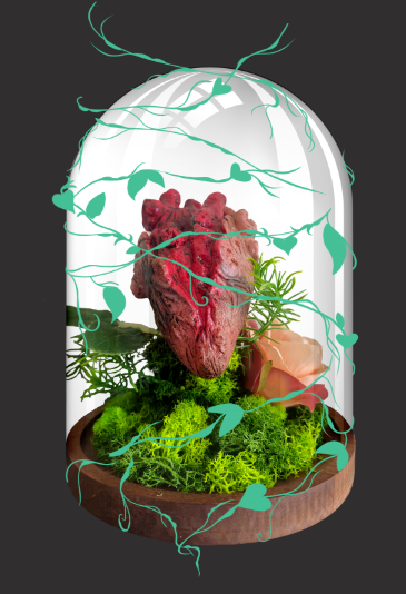
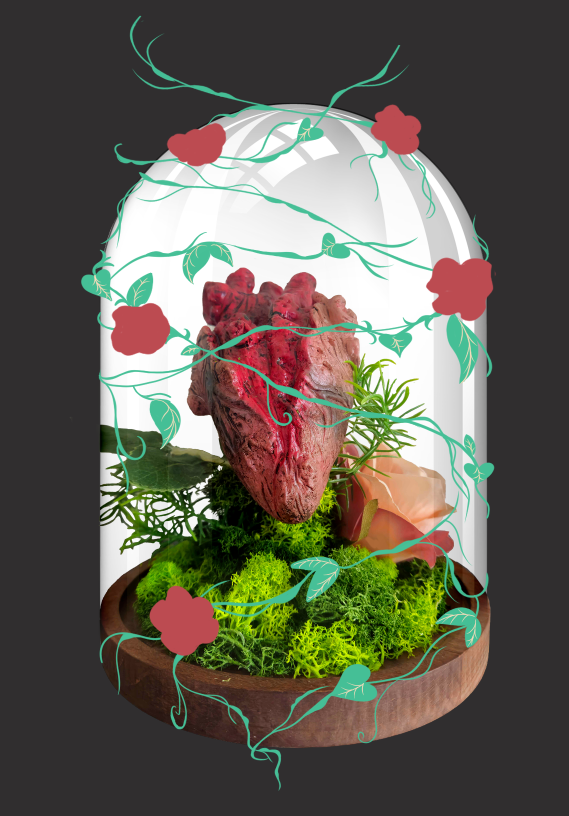
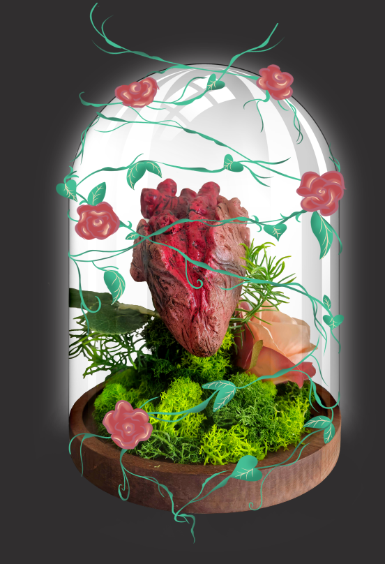
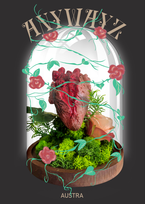
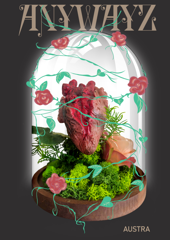
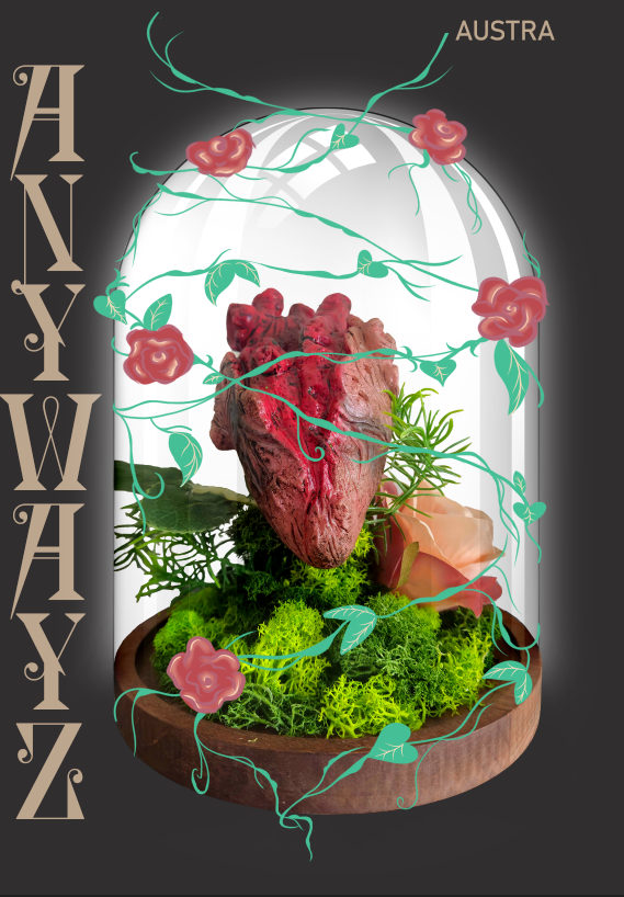
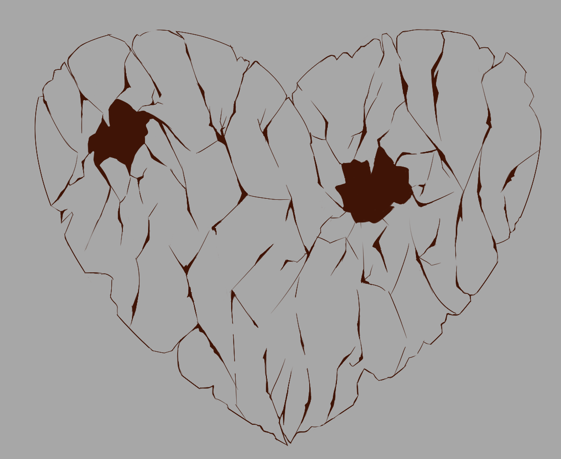
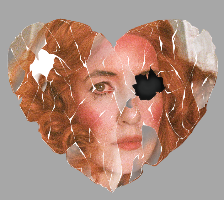
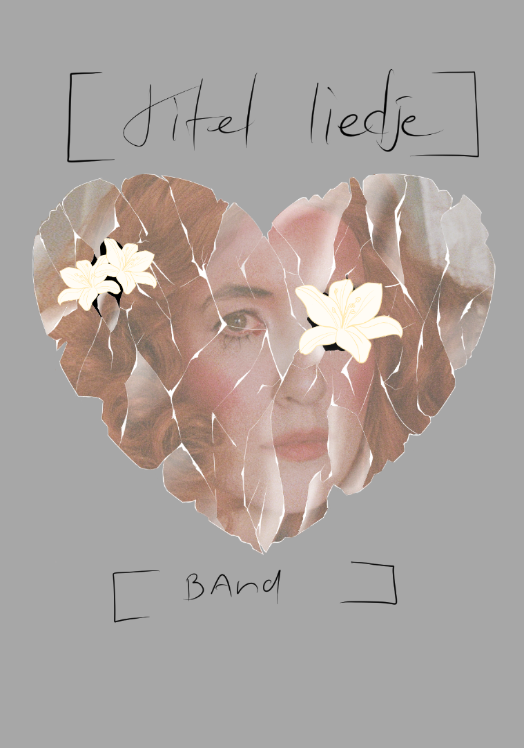
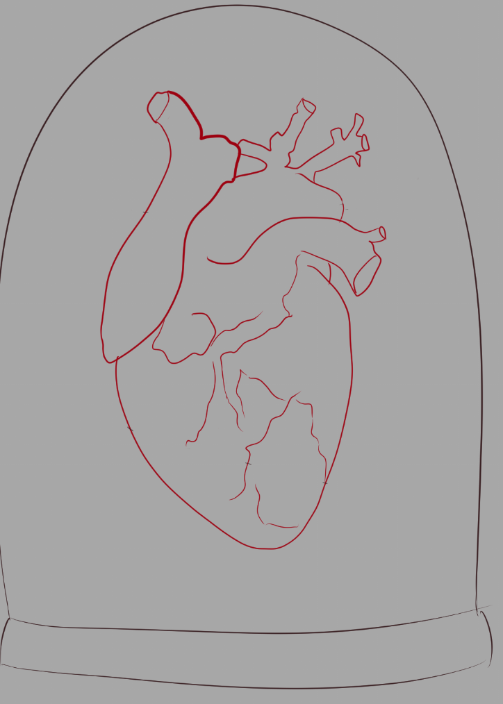
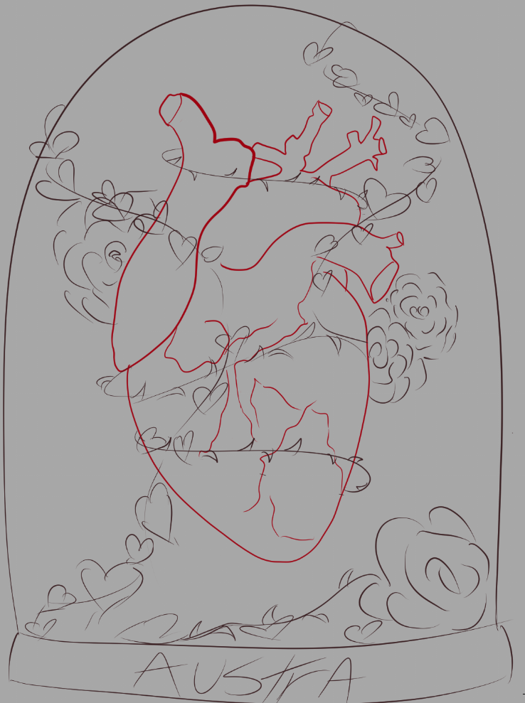
Concept 2 (chosen concept):
This concept focuses on the idea of being trapped in the past, represented by a heart enclosed in a glass dome, surrounded by overgrown roses and plants. This symbolizes the feeling of being unable to let go, as memories and emotions continue to take root—just like in the music video, where vines wrap around Katie’s leg. Each of my three concepts connects to the song in its own way, ensuring that the merch isn’t just visually striking but also deeply tied to the music and its message.
Concept 3:
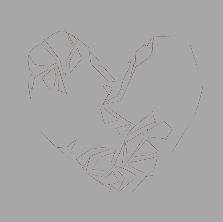
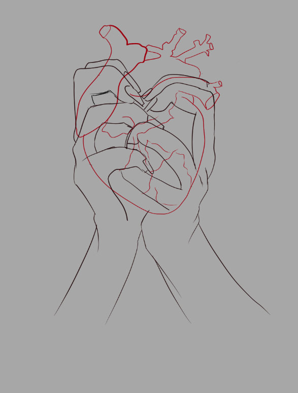
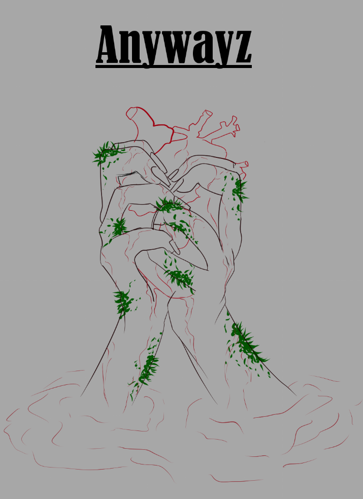
For my final concept, I took a different approach while keeping the heart from Concept 2. Inspired by Austra’s gothic and dark wave style, this design portrays Katie holding her own heart, with blood running down her hands. Over time, the blood pools beneath her, with her arms emerging from it—symbolizing how long she has clung to her heartbreak. Moss growing on her hands and arms reinforces this idea, representing isolation and sorrow.
This concept reflects the idea that she controls how long she lingers in pain. While it doesn’t reference a specific Anywayz music video scene, it captures the song’s deep emotions in an artistic way, aligning with my audience’s desire for meaning and creativity.
Color choice:
For the color palette, I’m focusing on black and red, as these were the dominant colors in my audience research. To enhance the emotional impact, I’m incorporating the authentic expression trend, ensuring that the cover stays true to the raw, heartfelt nature of the song and aligns with the music video’s storytelling.
Contact: HonokaKuroArt@gmail.com